Create a High Performance Showroom
When customers walk into your business, do they just see a sales counter? Creating an area with work samples for customers to see, touch, and discuss with sales representatives will help the customer visualize how your products or services fit the needs of a specific project.
The Science
Researches state that consumers look at design holistically, as a shell and also evaluate the design elements and content within the shell (Orth, Heinrich, & Malkewitz, 2012). If a picture is worth a thousand words than, what is a display that can be seen and touched worth? Experts suggest that visual displays are essentially external storage for our brains (Scaife & Rogers, 1996).
The Art
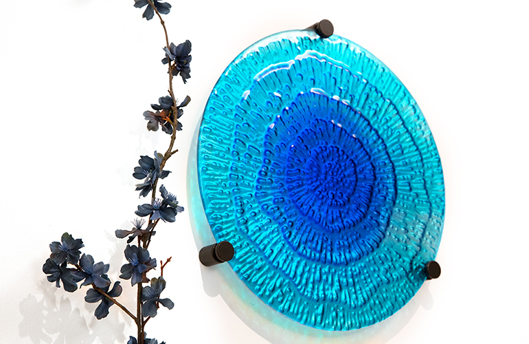
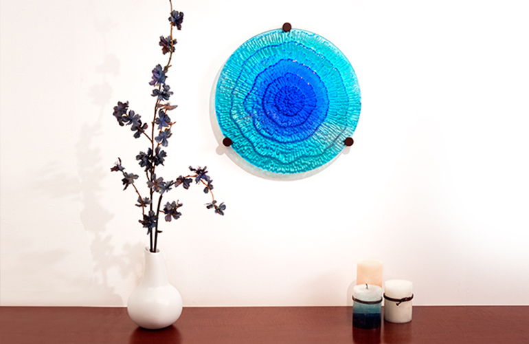
Visual Weight: In the picture below, the designer used an asymmetrical balance concept to frame the blue glass art. This means that the display is physically not equal on both sides but still achieves visual balance. There are three candles on right side of the glass art and one vase on the left, however a triplet theme is repeated with the mounting hardware. Note how the branches extend from the vase to form almost a crescent shape around the left side of the glass art drawing the attention of the consumer’s eyes to the centerpiece.
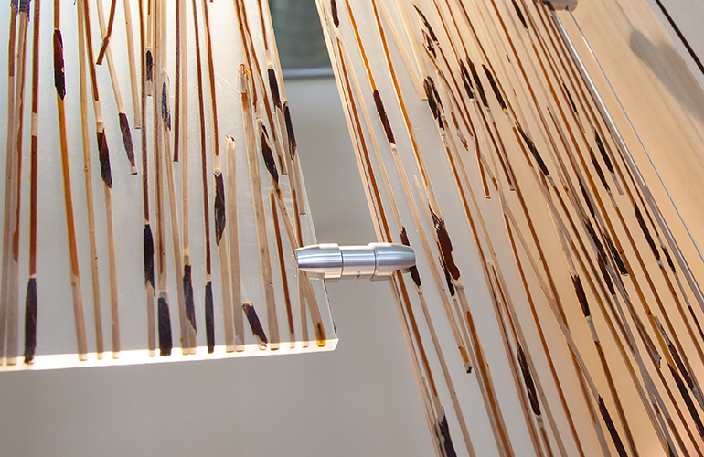
Color Balance: In the image below, the designer has drawn attention to the hanging hardware by using color and light to contrast against the metallic texture of the hardware.
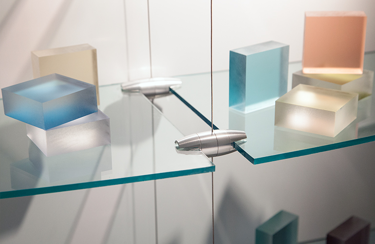
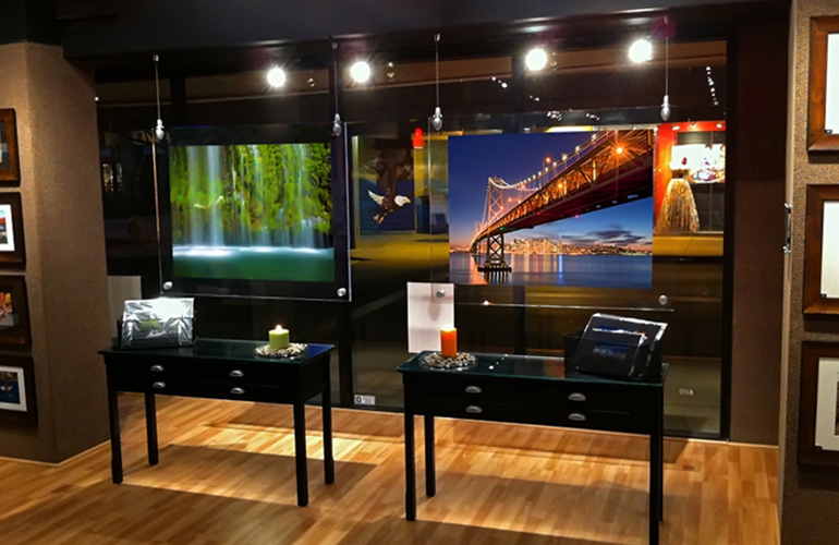
Negative Space: In this picture the wall cut-out only displays two small pieces of resin panel suspended by wire and grippers. This is a great example of using the negative space or air around the display to frame the important parts of the display.
